Most home bar carts look exactly like what they are: a collection of things someone grabbed and placed together. A bottle here, a glass there, a random cocktail tool that came in a gift set three years ago. The cart exists. The intention does not.
A bar cart that actually looks pulled-together is not about expensive bottles or matching metalwork. It is about setup sequence, visual weight, and knowing where one object earns its place and another fights for attention. Get the sequence right, and a $200 cart looks like a deliberate design decision. Get it wrong, and a $2,000 cart looks like a garage sale in the living room.
This guide walks through the exact setup order — what goes where, why it works, and where a whiskey decanter specifically changes the visual calculus of the whole surface.
A bar cart looks intentional when you set it up in this order: anchor first, then height, then glass, then tools, then accent. A heavy lead-free decanter placed at the back center creates the visual anchor the whole surface needs. Everything else organizes around it. Budget less than 30 minutes.
Step 1: Clear the cart completely
Before anything goes back on, remove everything. This matters because most people add to a bar cart over time — a bottle from a trip, glasses from a box set, a cocktail shaker from a birthday — without ever stepping back to assess what is actually fighting for attention. You can't see the composition when you're making incremental edits. Start from a clean surface.
Once it's empty, look at the tiers. Standard bar carts have two levels: a larger bottom tier and a narrower top. These tiers have different visual jobs. The top tier is your display layer — it gets seen first, at eye level, and should hold the objects that make the strongest first impression. The bottom tier handles volume: extra bottles, tools, and backup supplies that need to be accessible but don't need to command attention.
Step 2: Choose your visual anchor and place it first
Every bar cart that looks intentional has one object that functions as the anchor — something with enough visual weight to organize everything else around it. This is not the most expensive item. It is the item that has heft, height, and presence.
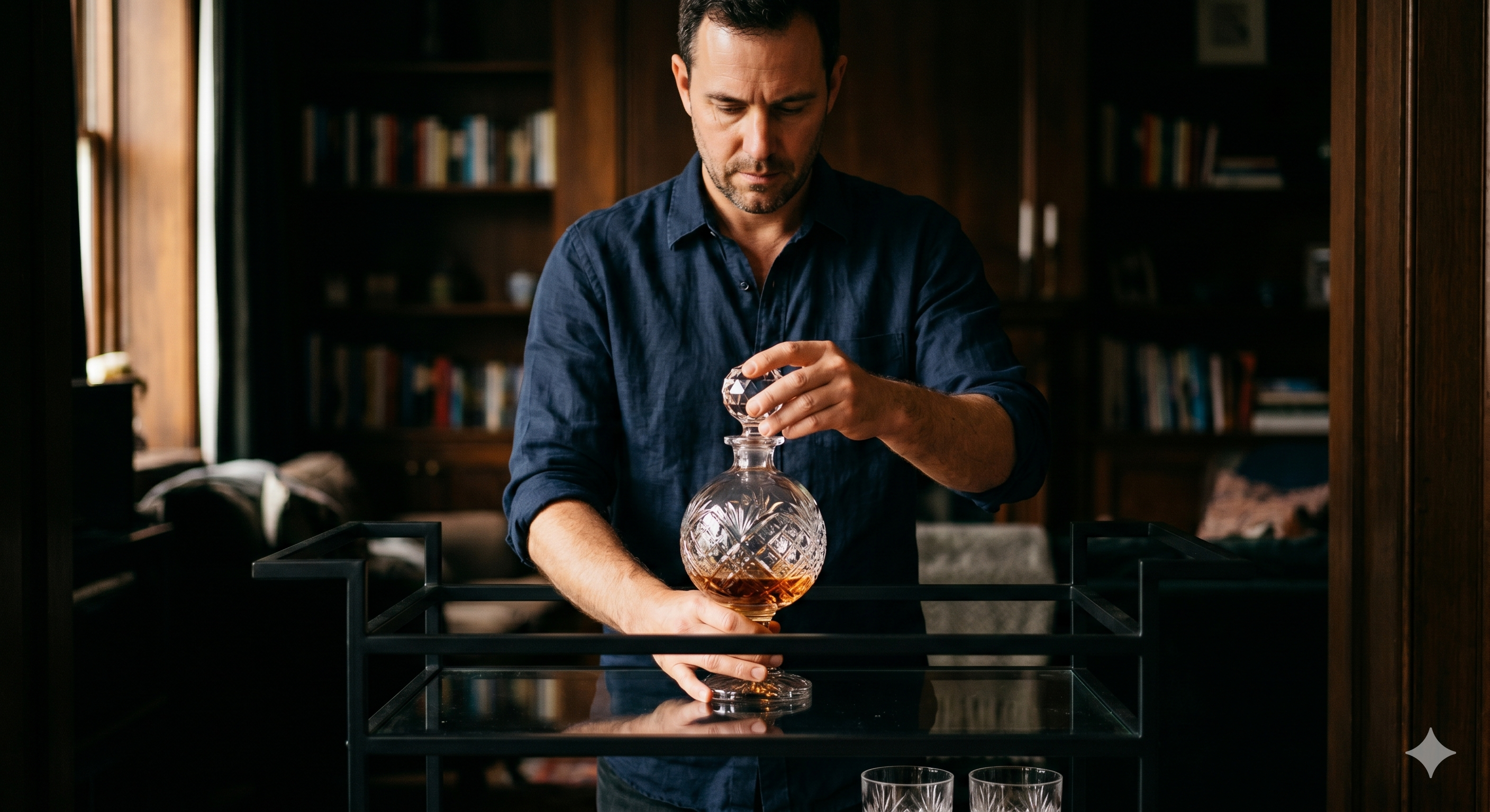
A whiskey decanter does this work better than any other bar cart object for a specific structural reason: it is tall, dense, and its stopper adds vertical punctuation. When you set a heavy lead-free crystal decanter at the rear center of the top tier, it immediately creates a focal point. Everything placed in front of it and to the sides becomes supporting cast. Without that anchor, the surface reads as a collection. With it, the surface reads as a setup.
The key word is heavy. A lightweight decanter undermines the effect entirely — the visual promise of substance is broken as soon as someone picks it up. Lead-free crystal with real heft (the kind where the base feels like it's protecting the table it sits on) is the difference between a bar cart that looks curated and one that looks like it was assembled from a gift set.
The Modern Decanter Set and Globe Decanter Set are both worth considering here — the weight difference over commodity glass is the first thing you notice when you pick one up.

Step 3: Build height variance, back to front
Bar carts look flat when everything is the same height. The fix is a simple principle borrowed from retail visual merchandising: tallest items at the back, shortest at the front, with one mid-height object on each side to create shoulders.
In practice, on the top tier: decanter at rear center, two standard whiskey or spirit bottles flanking it at the back corners, glasses at mid-height in the front two-thirds. If you have a cocktail shaker, it works as a left- or right-shoulder piece — it's taller than a glass but shorter than a bottle, which is exactly the mid-height you need.
On the bottom tier, the principle is reversed: keep the visual plane relatively consistent so the bottom tier doesn't compete with the top. Bottles stored here should be similar in height. Avoid placing statement pieces on the bottom tier — they get ignored or they create visual noise from across the room.
Step 4: Limit glasses to four maximum on the surface
The most common mistake on bar carts is too many glasses. Eight whiskey glasses on a cart does not signal generosity. It signals a lack of editing. Four glasses maximum — two pairs, or four of one type — is the visual limit before the surface starts to read as storage rather than a curated display.
Where you place the glasses also matters. Glasses belong in the front center of the top tier, slightly offset so they do not form a perfect grid. A subtle stagger — two glasses slightly forward of the other two — adds depth. Perfect symmetry on a bar cart looks staged in a way that symmetry in art does not: it removes the sense that someone actually uses this thing.
Step 5: One tool, one use
Bar tools on display should be limited to one or two, maximum. A cocktail shaker is often the right choice because its form is distinctive and its purpose is legible at a glance. A long bar spoon works similarly. What undermines the look: multiple tools grouped together (creates the impression of a utility drawer, not a bar), tools in a container (instantly looks like a pencil cup on a desk), and tools that are purely functional rather than design-forward.
If you have a set of tools you want to keep nearby, the bottom tier is the correct location. The top tier should hold no more than one tool — chosen for its form as much as its function.
Step 6: Add one non-bar object
This is the step most guides skip, and it is the step that separates a bar cart that looks like a display from one that looks intentional. Every bar cart that reads as genuinely curated has at least one object that is not obviously bar-related: a small book, a single plant, a stone coaster, a matchbox with a design-forward cover. One object. Not three.

The purpose of this object is to signal personality — that the person who set up this cart made choices, not just purchases. Whiskey enthusiasts who use a decanter as their anchor instinctively understand this principle: the decanter itself is already doing non-utilitarian work. Adding one further non-bar accent completes the edit.
Step 7: Audit from across the room
The final step happens before you consider the cart done: walk to the opposite side of the room and look back at it. Not two feet away. Across the room, as a guest would see it. Bar carts are room objects — they are perceived at distance before they are examined up close. If the cart looks cluttered at ten feet, it is cluttered. If it looks like it belongs in the room, the setup is done.
The most common revision at this stage: removing something. Almost every bar cart benefits from one less object than feels right when you are standing next to it.
Why a Decanter Changes the Visual Calculus?
The setup sequence above works with or without a decanter. But a whiskey decanter specifically changes what is possible on the top tier, for one reason: a bottle of whiskey has a label, a neck, and a shape that is designed for shelf storage. It is not a display object.
A decanter — particularly a geometric or globe-cut lead-free crystal decanter — is a display object first. Its form communicates something the bottle cannot: that the person holding this glass made a considered choice about the experience, not just the liquid. This is why bar carts with decanters read as more intentional than those without, even when the underlying spirit is identical.
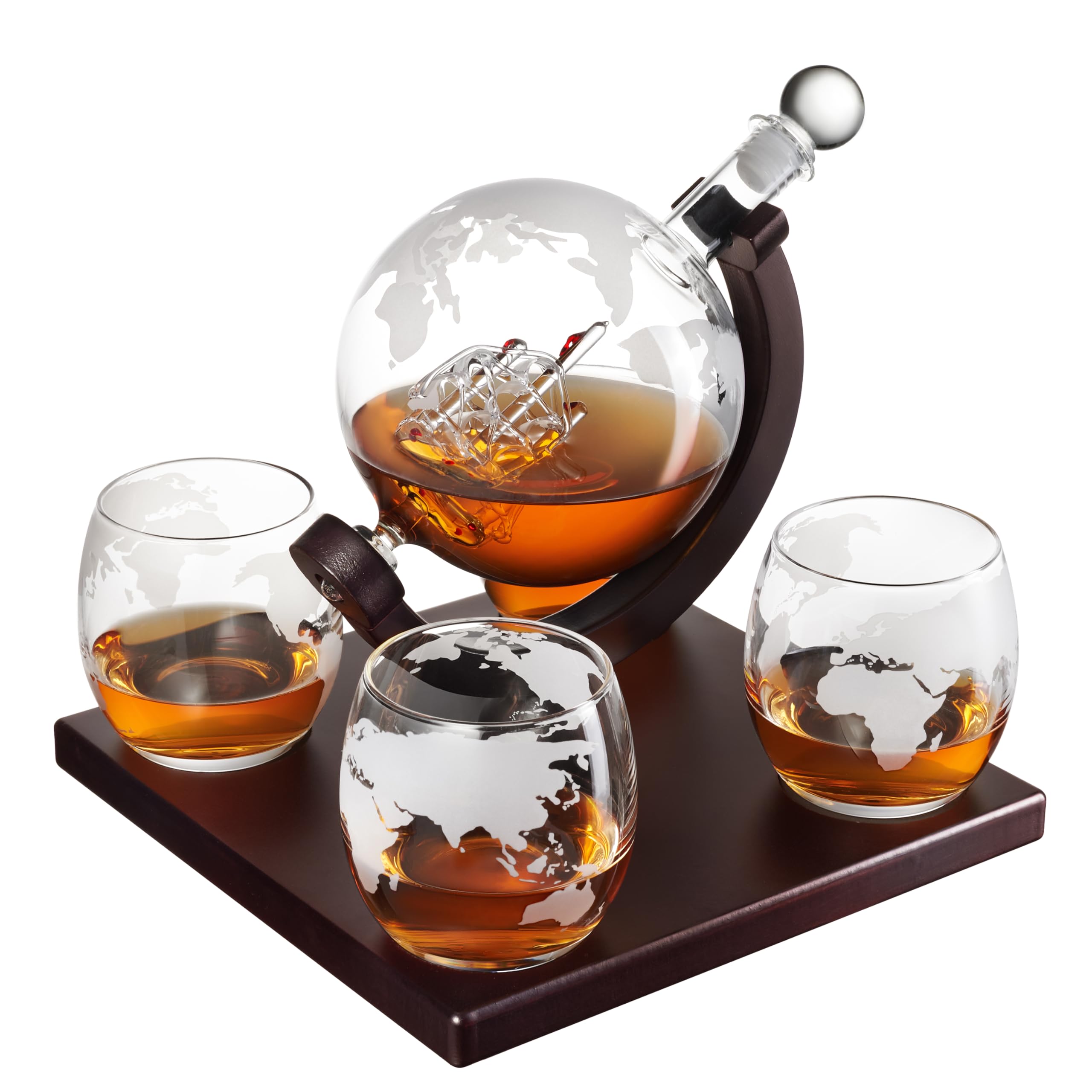
The Globe Decanter Set, the Twisted Decanter Set, and the Modern Decanter Set each have the two properties that make this work on a bar cart: real heft from lead-free crystal, and a stopper that adds vertical height without visual clutter. Set one at the rear center of your top tier as described in Step 2, and you have done more for the look of the surface than any arrangement of bottles alone can achieve.
Three Things That Always Undermine Bar Cart Styling
1. Mismatched metal finishes. Two competing finishes — brushed gold and polished chrome, for instance — create tension that reads as inconsistency rather than personality. Pick one metal and hold it across your tools and any hardware on the cart itself.
2. Bottles you never open. A bar cart should look used, not like a prop room. If you have bottles that have not been opened in two years, they go in the cabinet. The cart should hold what you actually drink. Authenticity reads across the room.
3. A tray you don't need. Trays are often recommended as a bar cart essential. They work when the cart itself is small and you need to create zones. On a standard two-tier cart, a tray on the top tier tends to shrink the usable surface and add a layer of visual noise. Use only if the cart genuinely needs to be subdivided.
For the full sequence on equipping a home bar beyond the cart itself, the Hydro Gizmos accessories collection covers what belongs on the shelf versus the cart surface. And if you're buying a decanter for the first time — for your own setup or as a Father's Day gift — the breakdown of which decanter fits which bar aesthetic is worth reading before you decide.
A bar cart that looks intentional is not a styling problem. It is a sequence problem. Get the anchor right, build height variance back to front, limit the glass count, choose one tool for the surface, add one non-bar object, and audit from across the room. That is the full system.
The decanter earns its place in Step 2 not because it is the most premium object you can own, but because it is the only object on a bar cart that does display work a bottle simply cannot. Set it there first, and the rest of the cart organizes itself.
Ready to set the anchor?
Every Hydro Gizmos decanter set is 100% lead-free crystal — built with the heft and stopper quality that makes the visual anchor work. Ships in premium presentation packaging.
[ Shop Decanter Sets ] → https://www.hydrogizmos.com/collections/luxury-decanters
— BODY COPY ENDS —

Share:
Your Dad Has Everything. Give Him the One Thing That Actually Stays.